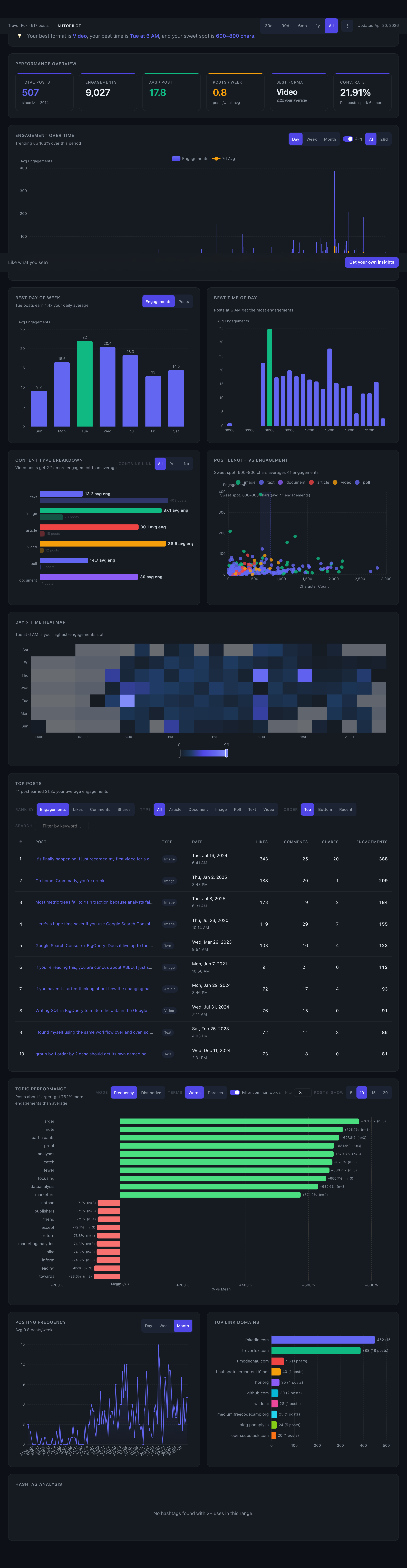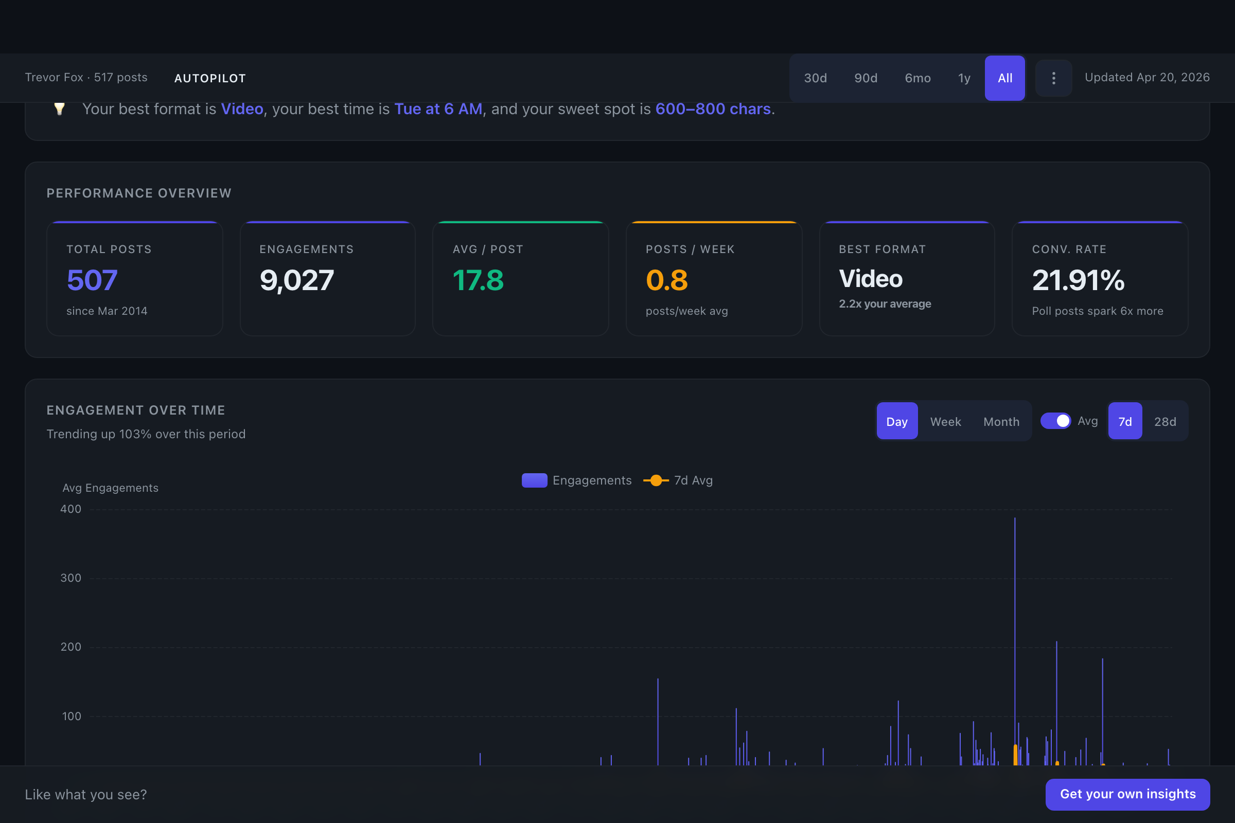
KPI cards at the top of the dashboard — engagements, followers gained, top format, and posting consistency. The answer to "is LinkedIn working?" in five seconds.
The Dashboard
LinkedIn's native analytics stops at 365 days and won't tell you what is working. Flux pulls every post you've ever published and shows you what drives engagement — by format, timing, topic, and length.

The pain is real
“I export to spreadsheets every month because LinkedIn's UI is useless for coaching clients.
“My boss asks "is LinkedIn working?" and I have no credible answer.
“I want to know if that one viral post was luck or a pattern I can repeat.
What’s on the dashboard
Every chart is interactive, filterable, and cross-linked. Click a topic to see every post that mentions it. Filter by date range, format, or keyword. Your whole posting history, one pane of glass.
KPI cards at the top of the dashboard — engagements, followers gained, top format, and posting consistency. The answer to "is LinkedIn working?" in five seconds.
Daily, weekly, or monthly engagement with an optional 7 or 28-day rolling average. Toggle growth-adjusted mode to strip out the lift from new followers and see whether your content is actually getting better. Edge: growth-adjusted
Two standalone charts plus a Day × Time heatmap. This is your audience — not LinkedIn’s generic “post Tuesday at 9am” advice. Toggle between engagement and post count to spot under-used windows.
Text, image, video, document, and poll — total engagement and per-post average, side-by-side. Filter by whether a post contains an external link. Separates "what you post a lot of" from "what actually works."
A scatter with a fitted curve showing the length sweet spot for your audience. Each dot is a post — hover to read it. The curve tells you where the payoff peaks and where returns fall off.
The full 7 × 24 grid of when your posts land best. Dark cells show hot windows — light cells show dead zones. Pairs with Best Day / Best Time to reveal combinations you'd miss from the bars alone.
Rank by engagement, likes, comments, or shares. Filter by type. Sort top / bottom / recent. Search by keyword. On Edge, every post shows expected engagement (what the model predicted) and an overperformance delta — so you can see which posts beat the pattern, and by how much. Edge: overperformance
Words and phrases from your posts, ranked by frequency or distinctiveness (topics that consistently beat your average). Filter stop words. Click any term to filter every other chart to just those posts.
Posts per day, week, or month, plotted over time. The consistency chart — because compounding only works if you show up. Gaps and streaks jump out at a glance.
Which external sources your audience actually clicks on. Your own blog, Substack, YouTube, industry publications — ranked by how often you link and how those posts perform.
The hashtags that help, the ones that don't, and the ones you've never tried. Ranked by reach lift versus your baseline — so you stop copy-pasting the same five tags out of habit.
#leadership adds noise. #founders adds +28% reach. Drop four, double down on one.Every chart has an auto-written insight line above it and every chart talks to the others. Click a topic, filter the heatmap. Change the date range, everything re-renders. This isn't 12 static screenshots — it's one connected lens on your posting history.
Multi-profile switcher
Analyze any public LinkedIn profile — yours, a client's, a competitor's, a prospect's. Switch between profiles from a dropdown in the header. Agencies and coaches use it to run weekly reviews across their book. No login, no OAuth, no Chrome extension on anyone's machine.

Export
Download your full post history as CSV (for spreadsheets and reports) or JSONL (for pipelines and AI tools). Every field we have on every post — timestamps, engagement, text, media, links, hashtags, derived topics. Nothing locked in.

Who it’s for
Creator-Educator
The consistent poster
Posts 2–5 times a week. Has been at it for 18 months and still guesses at what lands. Uses the dashboard to answer: "Which of my last 300 posts should I write more of?"
Agency Owner
The agency reporting to clients
Manages LinkedIn for 4–12 clients. Needs a defensible, export-ready view for monthly reviews. Switches between profiles from the header. Pulls a CSV into the deck.
Corporate Thought Leader
The exec who needs a weekly read
Posts once or twice a week, has a ghostwriter, doesn't want to log into a dashboard. Gets the Pulse weekly email digest with the headlines — drops in when something needs a closer look.
Tier availability
What changes across tiers is how fresh the data is and what the intelligence layer adds on top.
| Feature | Pulse$30 / year | Edge$10 / month |
|---|---|---|
| Full dashboard (12 charts) | ✓ | ✓ |
| CSV / JSONL export | ✓ | ✓ |
| Multi-profile switcher | ✓ | ✓ |
| Data refresh | Every day | Every day |
| Growth-adjusted metrics | — | ✓ |
| Expected engagement & overperformance on every post | — | ✓ |
| Score My Post (pre-publish prediction) | — | ✓ |
| Explore (semantic search) | — | ✓ |
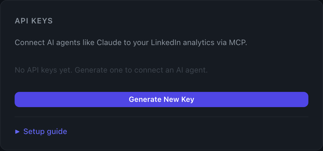
| MCP / API access | — | ✓ |
Keep exploring
Three features built on top of it — each one answers a different question the dashboard raises.
Score My Post
Predict before you publish
Paste a draft. Get an expected-engagement score trained on your history, with suggestions on length, format, and timing.
See Score My Post →
Explore
Search by meaning, not keywords
Semantic search over your entire post history. Find the three posts you wrote about pricing even if you never used the word "pricing."
See Explore →
MCP & API
Connect to Claude & AI agents
Your dashboard data as a tool-callable API. Ask Claude questions about your LinkedIn history in natural language.
See MCP →
No LinkedIn login. No Chrome extension. Just enter your URL and we'll pull your history.